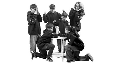
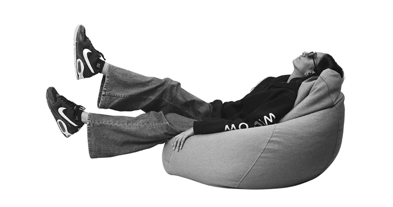
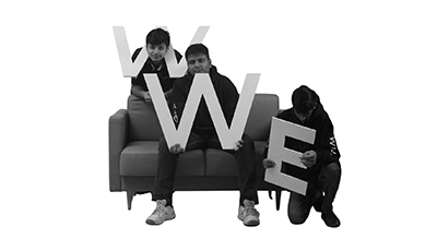
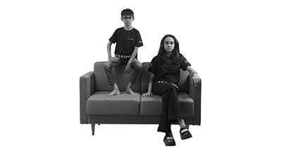
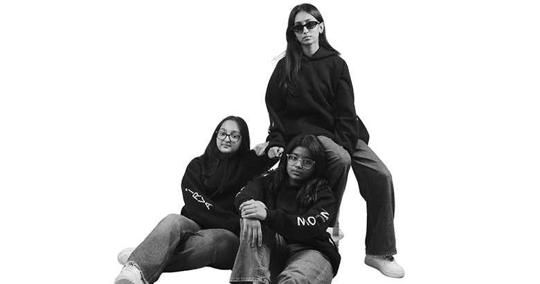
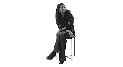
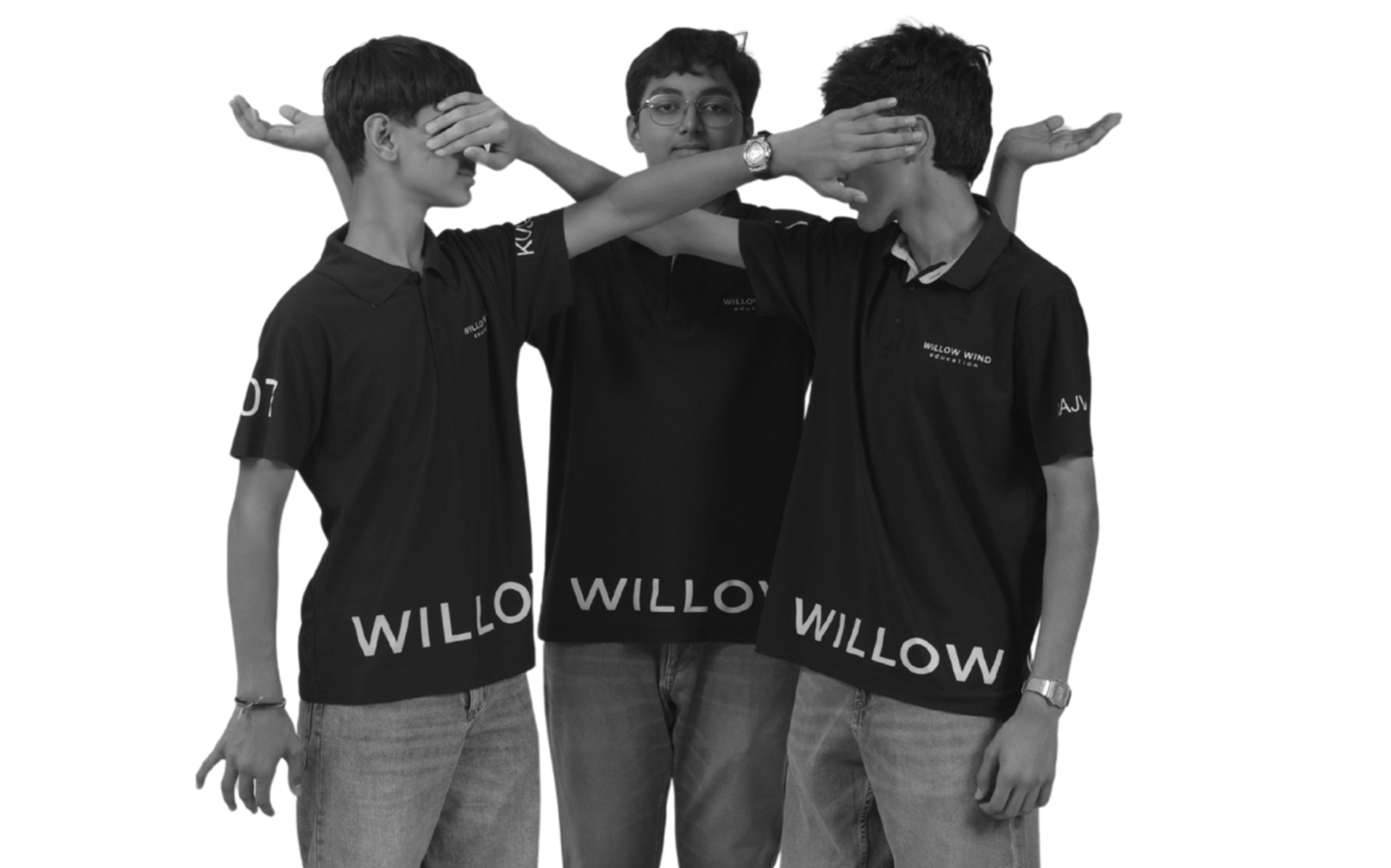
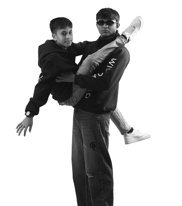
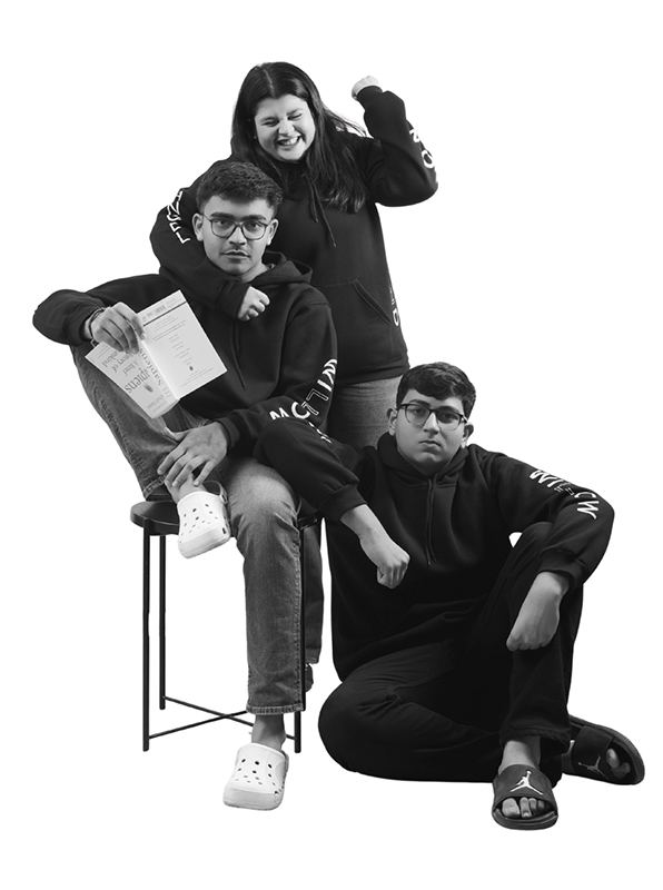
Tuition classes all say the same thing, better marks, better discipline, better students. And visually, they all look the same too. Staged smiles, straight lines, predictable frames. Willow Wind didn’t want to compete in that sameness. The challenge wasn’t credibility. It was memorability.
We flipped the lens. Instead of control, we chose expressions. Kids being kids, unfiltered, unrehearsed, real. Movement over posture. Chaos over perfection. The shoot wasn’t designed to look proper. It was designed to feel alive, full of personality, energy, and spontaneity.
Every frame leaned into unpredictability. Playful props, unexpected poses, moments that feel caught, not constructed. Visuals that break the category codes while still feeling authentic. The content didn’t try to “sell education.” It showed an environment kids actually want to be part of.
Willow Wind stopped blending in and started standing out. Not louder, just different. It challenged the idea that learning has to look rigid to be effective. Now, it doesn’t just attract students, it attracts attention. Because sometimes, the smartest move is to break the pattern.